

Timbuk2
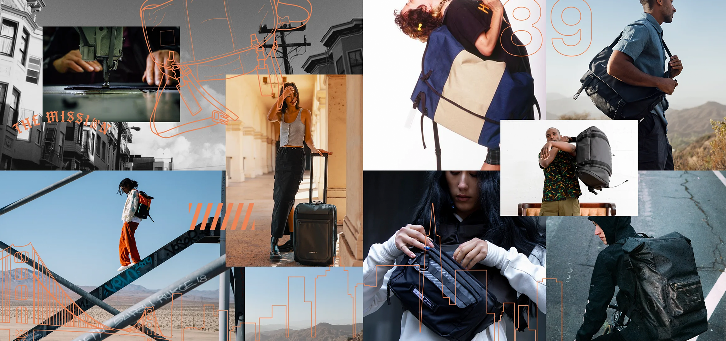
Timbuk2 is a bag and backpack brand that was brought to life in San Francisco’s Mission District by a bike messenger named Rob Honeycutt. The brand focuses on creating highly customizable bags using durable and sustainable materials that can stand up to weather and the wear-and-tear of everyday use.
In 2019, Timbuk2 was acquired by Exemplis, and since then they have expanded the brand’s product offering and customizable textile options. Exemplis sets itself apart from its competitors by creating highly customizable and personalized products in both their B2B and DTC brands.
Strategy
In my work with Exemplis and Timbuk2, I met with key stakeholders in the business like the GM, CEO, CIO, and others to understand their KPIs and to educate them on how improving the site UI and UX can help them achieve several of their goals.
Together we identified some key initiatives that started with Timbuk2 and could be repeated in Exemplis’s other DTC brands:
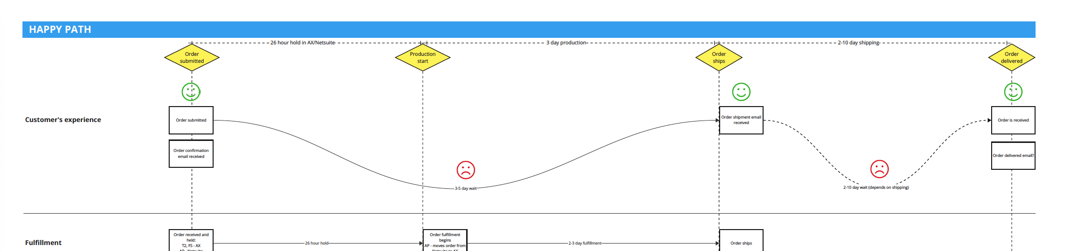
Moving to a build-to-order business model rather than having a large amount of products in stock, which included mapping our current and future processes
Onboarding heatmap, session recording, and A/B testing tools to better understand customer interactions on site
Onboarding price and brand reputation monitoring tools to help GMs and key stakeholders understand our brand and product placement in market
Optimizing PDP interactions for mobile to increase conversion rates
Adding new options for our customizable products
User Experience & Interface
One of our key initiatives for Timbuk2 was to introduce 20 new colors that users could choose for different components to customize their bags. This presented a unique challenge especially on mobile. On the site we saw a majority of users access our site on mobile (~55%), so it was crucial to optimize that experience. I protoyped several options and ultimately chose a horizontal slider as the best way for the user to quickly browse through our 40 color options and still be able to easily navigate to multiple bag components. This allowed the user to more easily play with many color options on many different bag components, and it greatly increased two key metrics: add to cart rate and purchase rate.
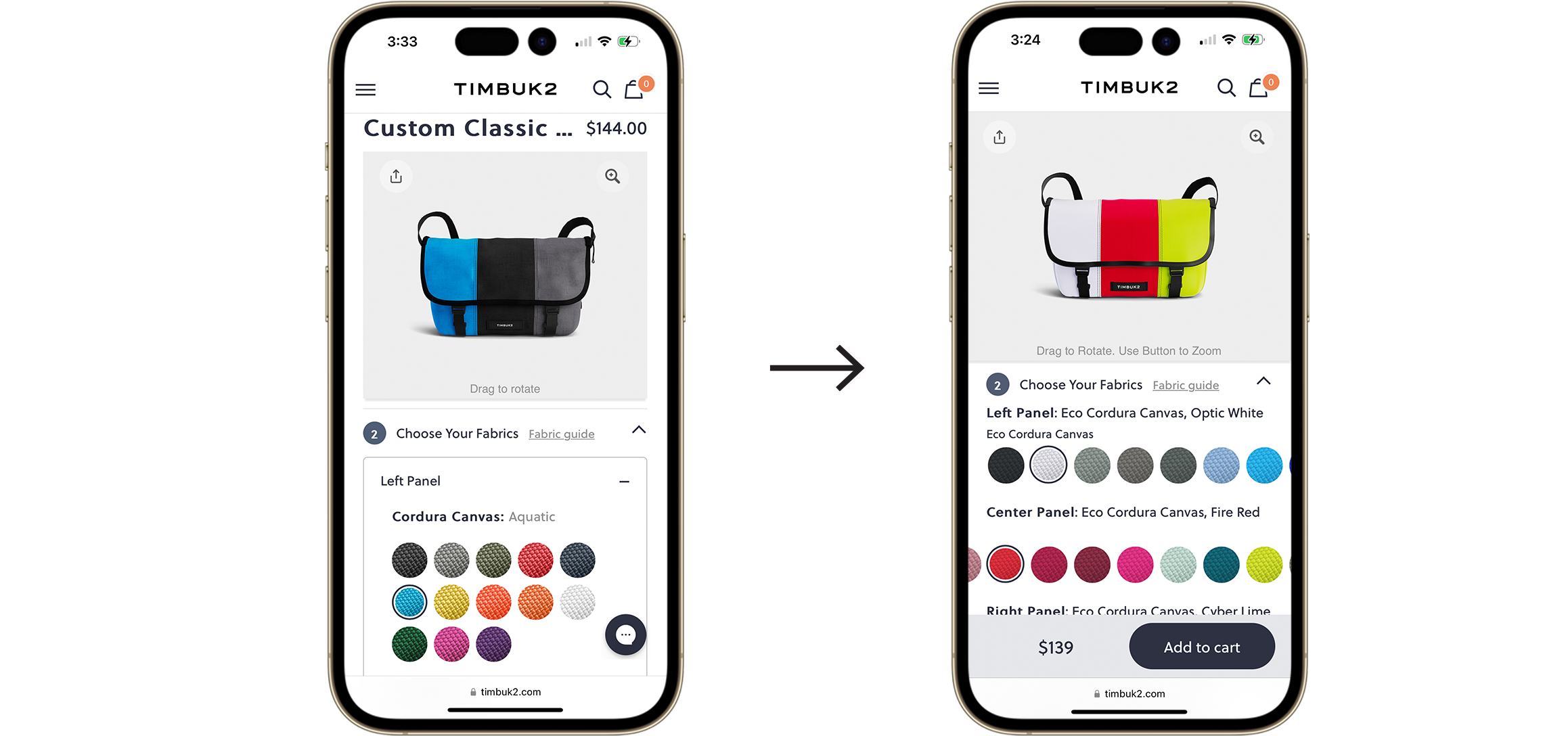
In the first month after we implemented this change, we had 37% more custom products added to cart on mobile and 87% more custom products purchased on mobile (over the previous period when we had the old UI).
Process & Comms
Digital product process:
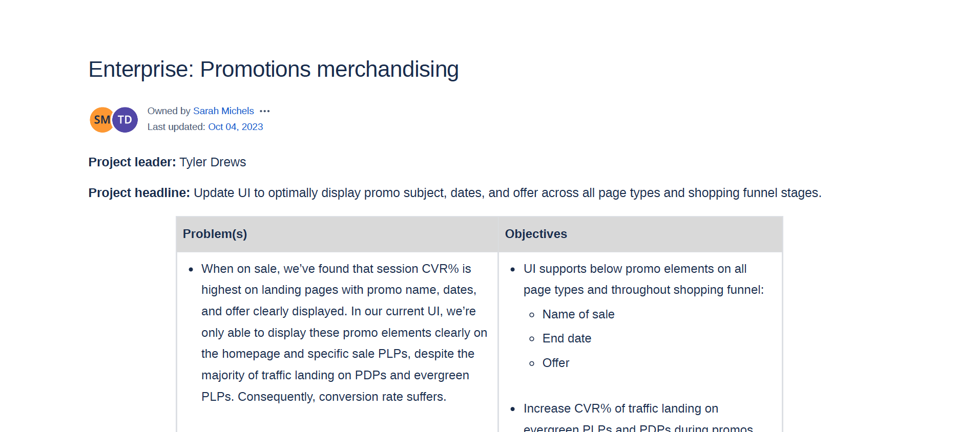
I worked directly with the VP of E-Commerce and to build the muscle of strategic quarterly planning, which was a new concept for Exemplis. When I began with them, they were reacting to priorities that were handed to them from more mature orgs: IT, marketing, etc. who had C-suite sponsors. I collaborated with the VP and the CEO to identify key areas of growth and efficiency for their business, which allowed me to work with the e-commerce site managers to translate those key areas into actionable initiatives with requirements and roadmaps that could be prioritized accordingly. The team and I implemented processes that started with drafting product requirements documents, which were built out for each project so all teams (business, design, and development) understood the project purpose.
Leadership comms:
While we implemented process changes, I led bi-weekly meetings with the CEO to present upcoming improvements which included UI updates, navigation changes, new landing page concepts to increase conversion from paid ads, and large website redesigns. These UX and UI updates were coordinated with key technology and marketing updates to launch new products, feature new creative campaigns, and complete important tech updates like backend system upgrades to AEM, Shopify, Netsuite, and more.
Programs Used
Figma
Adobe Creative Suite
Microsoft Word, Powerpoint, Excel
Miro
Confluence
JIRA
Zoom